


“For elementary-age children to discover the joy of making music!”
A responsive website for children’s piano lessons application and keyboard. Created for a Designlab student project.
Deliverables
Comprehensive Research
User Interviews
User Flows
Information Architecture
High Fidelity Wireframing
Brand Style Guides
Collaborators
Project Manager
Group Crit Peers
Users Participants
Tools
Figma
Miro
Adobe Suite
Overview
The inspiration for Kease emerged from discussions with close families about their children's music lessons during remote schooling. While music education is recognized for enhancing language skills in children, learning an instrument can be challenging for children and their caregivers, especially in a remote environment.
Objective
To understand what motivates children to continue practicing an instrument so that we can develop an engaging and motivational music education product.
Research & Empathize
Research Goal
To understand what drives children to continue practicing the piano and get through learning curve challenges, enabling us to maintain their motivation during challenging learning periods.
Methods & Objectives
Compare competitors in music education platforms and successful children’s education platforms to evaluate features, strengths, and areas of opportunity.
Competitive Analysis
*Keyboard keys that light up are the common feature of the best-reviewed learning keyboards.
*Most searches for “children’s remote piano lessons” feature outdated piano programs and websites.
*Lumi, One Piano, and LOOG all feature an instrument with a corresponding application.
*Lumi and One Piano are over $200 -$500 and are not designed for children.
*LOOG Guitars has a clean, modern interface, bold colors, and fun images. The application interface is designed for children. The best model for a variety of teacher-led classes and game-based practice.
Participants
2 Parents: Each has 2 children enrolled in music lessons with experiences with remote music classes.
5 Children Ages Children between the age of 6-12 who are currently enrolled in or have recently discontinued piano or musical instrument lessons.
User Interviews
During user interviews, I asked parents and children a series of open-ended questions to uncover the motivations and difficulties behind learning to play piano.

Interview Insights
Motivations
Learning something new is hard.
Duolingo is the favorite education app mentioned.
Parents are the reason they are taking piano lessons.
Many children love to perform what they learn.
Kids interviewed love watching their peers perform songs and dances on social media.
Children love to customize their games, avatars, and lessons.
Kids interviewed love watching short tutorials on YouTube and TikTok.
Parents sometimes use screen time to incentivize children to practice.
Pain Points
Too hard to reach the keys on the full-scale piano for young children
“Our Piano teacher is old-fashioned.”
“The songs we learn are baby songs.”
Many children interviewed mentioned wanting to perform, watch their peers, and share.
Children want to customize what they learn, the songs, the avatar, and their learning plan.
Many children enjoy watching tutorials on YouTube shorts and TikTok videos.
Parents want to limit screen time.
Parents also mention using screen time to incentivize children to practice.
Needs
Piano should be a children’s scale
Options for children to choose the songs they learn to play
Motivating reminders, rewards, positive feedback, and encouragement.
Music appreciation.
Short lessons for the sense of progress & accomplishment.
Variety of levels and learning plans.
The product should include games.
Play keyboard without a screen.
Any social sharing must allow only positive feedback to be sent.
Define
Synthesize
Leverage interviews and compedative analysis to identify goals and key features for Kease, using User Personas, Features Roadmap.
User Personas
My interview synthesis revealed three Personas to consider when creating our product: The Precocious Student, The Energetic Child, and the Attentive Parent.
Ideate
Developing Strategy
Focus on a responsive marketing and retail website highlighting the physical product and corresponding education platform to get user feedback before developing the physical product.
Organize the features into an information hierarchy to help visualize how the platform should function and flow.
Deliverables
Create Information Architecture, User Flows, Sketch Wireframes and build Prototype
Sitemap
Created a feature roadmap to prioritize the must-have elements for the product launch and help create the information hierarchy for the navigation menu and all pages needed to ensure all features are included and menus are intuitive.

Task Flow
Parent Persona: browses keyboards> selects and adds to cart> review app subscription membership>begin checkout> add payment details> review and complete order

Wireframes
Referencing sitemap and task flows as a guide, I loosely sketched the wireframes for the responsive website.
Desktop: Lo-Fi Wireframes
Responsive Wireframes
Using Figma, I transferred my sketches into mid-fidelity wireframes. I focused on mobile first and used a grid layout, thinking of icon set, cards layout, button placement, and overl UI design.
Responsive Design: Mobile First Mid-fidelity Wireframe
Responsive Design: Desktop Mid-fidelity Wireframe
Design
Strategy
The Keyboard, Music Education Application, and Responsive Website must have a visually cohesive design. This is crucial in establishing a strong foundation for the brand and creating a unified visual experience.
The Kease UI Design Kit must be bright, playful, and modern to cater to parents and create an exciting children's application for kids. Incorporating a colorful rainbow theme will provide a vibrant color palette for all products and screens.
Deliverables
Logo and brand design
UI Kit
Applying UI design to wireframes
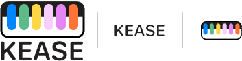
Logo Design
Branding Design for Kease Application, responsive website, keyboard, and future products. Rounded minimalist Typography and playful colors with a Keyboard shape
Logo branding
Style Guide
Kease UI Style sheet
High-Fidelity
Using the UI components, I applied color, branding and photos to the mid-fidelity mobile first wireframes.
Hi-Fidelity Wireframe

Prototype
Build
Create a click-through prototype to model the user's journey and experience and find areas of confusion, friction, and areas to improve.
High-fidelity Figma click-through prototype

Test
User Testing
With the prototype created, it was time to evaluate the concept and uncover the revisions necessary to optimize the product and process.
Deliverables
Usability Testing, Affinity Map, Priority Revision Matrix
User Tasks
5 User Test Participants were not given the background on the product to understand if they comprehend the relationship between the keyboard and the application.
Additionally, users were prompted to browse the products, select one, and decide if they would like to create an account and purchase a membership.
Finally, we asked users to complete the checkout process to ensure it’s as frictionless as possible.
Testing Goal
To test assumptions of how users would view the Kease Keyboard and its relationship to the application and creating an account. Evaluate how users navigate the responsive website, account creation, and checkout.
User Testing Affinity Map
Test, Listen, Learn.. Prioritize
Priority Revision Matrix
User Testing Feedback
Most users interviewed requested clarity on the need for the Kease Application for lessons.
Made the hero section an information video based on user feedback.
Created the “How it works.” section on the landing page.
Made clearer titles on the homepage for “Library,” “The App,” and “Keyboard.”
Created order confirmation screen for “Express Checkout.”
Made text darker and larger for checkout screens
Iterate
Why
To improve the product based on the user testing
How
Revisions were made to better communicate the relationship of the keyboard and the application and improve any friction in the shopping and checkout process.

What’s different?
Made the hero section into an informational video to introduce the product and application.

What’s different?
Added “How It Works” section to guide the purchase process.

What’s different?
Added the Steps to enforce further the need to connect to the app for lessons.

What’s different?
Added an additional communication banner regarding the keyboard and App pairing.
Whats different?
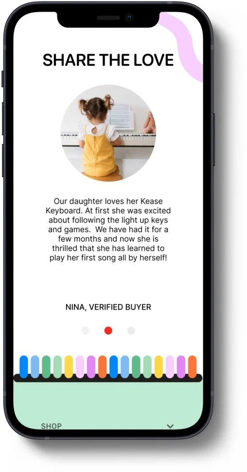
Added the rainbow keys symbol to the area between the review section and the footer.

What’s different?
Added a link to the KEASE Application in the Google and Apple App stores.
Next Steps
Return to the design process to build a demo of our Kease application for children’s remote piano lessons!