


A case study and prototype designed specifically for caregivers of children dependent on feeding tubes for nutrition.
Seamlessly manage feeding schedules, track nutritional intake, set personalized alerts, and effortlessly connect with essential resources for your child’s care journey. Share charts with medical professionals and streamline organization between parents, caregivers, and nurses.
Role
Sole product designer
Deliverables
Comprehensive Research
User Interviews
User Flows
Information Architecture
Brand Style Guide
High Fidelity Wireframing
Prototype
User Testing
Duration
2 weeks of topic research
10 weeks interviews > case study
Project Overview
The U.S. preterm birth rate was about 10% in 2022. Most preterm babies need a feeding tube initially due to challenges in coordinating sucking, swallowing, and breathing. However, caregivers lack the tools to manage their children’s feeding schedule and growth once they're discharged home.

An estimated 15 million newborns are born preterm, and more than 20 million are born with low birth weight each year.
(World Health Organization)

Approximately 70-75% of premature babies require a feeding tube initially due to challenges in coordinating sucking, swallowing, and breathing.

Many children are discharged home with feeding tubes to supplement nutrition for continuous growth.
Parents & caregivers have limited tools to manage their children’s feeding management from home.
Objective
This project strives to contribute to the well-being of caregivers and their children, recognizing the delicate balance between technological innovation, ethical considerations, and practical constraints.
The goal is to offer caregivers a convenient support system, incorporating a management tool and access to valuable resources to find answers and guidance. We aim to normalize the experience of tracking their child’s needs and nutrition and improve the care experience for them and their infants.
Research & Empathize
Research Goal
To gain comprehensive insights into the obstacles faced by parents and caregivers in effectively managing and administering Gtube feedings for their infants at home, to identify areas for improvement and develop targeted support solutions.
Methods & Objectives
Research available resources for G-tube and medical device management. Compare patterns and features. Review infant tracking applications specifically those with real-time tracking solutions.
Competitive Analysis

Application gap for infants needing feeding tubes: Despite extensive research, no existing applications were found specifically tailored for tracking G-tube feeding and nutrition in premature infants, highlighting a gap in available tools for this specific caregiving scenario.
Disclaimers in Infant Applications: A common trend across all infant applications is the inclusion of disclaimers regarding the safety and information provided within the app. This underscores the need for caution and medical professional consultation when using the tool. Clarity of users’ liability must be in combination with their Doctor’s personalized advice.
Disclaimers in Medical Applications: Similarly, medical applications designed for professionals also include disclaimers regarding the information and calculations recommended within the application. This emphasizes the importance of clarity and transparency in communicating the limitations of such tools.
User Interviews
Participants
Participants were asked open-ended questions about their experiences caring for infants relying on feeding tubes.
2 Pediatric NICU Nurses who treat patients who rely on feeding tubes.
3 Parents of children who rely on feeding tubes.

Interview Insights
Motivations
I want to monitor the feeding through my phone.
I relied on the Facebook Forum groups for other G-tube families. It’s been really beneficial.
We have a million appointments, doctors’ notes, and calories to track.
I keep a food journal to track all of her calories.
Pain Points
We saw so many different doctors and professionals and we got sent home with a PDF and a Google document
I tried to use Huckleberry or other infant schedule tracking apps but they felt a little triggering and highlighted that our experience was different."
We came home with one sheet of information and I was nervous and made a lot of mistakes.
Needs
A more convenient tool to keep a food journal and track calories and reactions.
A way to track the history or record the G-tube pump.
A convenient way to track and order supplies.
Easy way to share the feeding and reaction history with medical professionals.
Key Findings from Research and Interviews

Parental Exclusion and Triggers: Interviews revealed that parents of children with unique needs often feel overlooked and triggered by existing infant apps. These apps lack options that resonate with their caregiving requirements, emphasizing the need for a more inclusive solution.
A G-tube Pump Compatible Solution: Interviews revealed that most parents would like a tool to monitor the pump's progress in real-time. Parents highlighted the desire to turn the pump on and off remotely and schedule a feed to begin at a specified time, allowing for night feeds without caregivers needing to enter the room, potentially disrupting infants’ sleep.
PICU Nurse/Hospital Already Have Resources: Research and interviews with pediatric nurses revealed an array of in-hospital tools to record and calculate G-tube feedings and medication. These tools are designed for professional use and are too technical for home use. Additionally, they lack features crucial for individualized care, such as the ability to save data for a specific child, highlighting the need for an accessible and personalized solution for home caregivers.
Define
User Personas
My interviews inspired two Personas, the Organized and Overwhelmed Parent and the Pediatric Home Healthcare Aid


Working within constraints: Major considerations
Caregivers would like a tool to directly interact with the feeding pump for parents, however, the inherent safety and security risks render that option unfeasible.
Healthcare practitioners in hospitals have access to feeding tube management resources.
There is a need for a tool tailored for home-based caregivers and interventionists.
Ideate
Working within medical technology limitations, create a tool to help parents and caregivers organize, record, and share information about their child. Create a community, resource, and troubleshooting tool, allowing seamless sharing with healthcare professionals.
Organize the features into an information hierarchy to help visualize how the platform should function and flow.
How
Create Information Architecture, User Flows, Sketch Wireframes and build Prototype
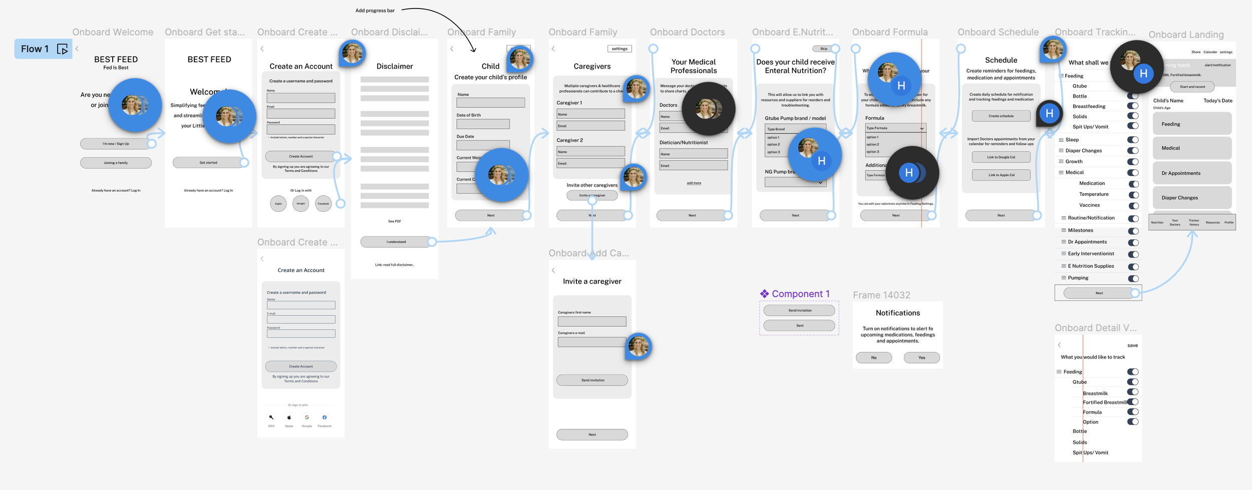
Task Flow
Caregiver_Task flow 1: Complete full onboarding
Caregiver_Task Flow 2: Schedule or add a feeding to record
Wireframes
Referencing the task flows as a guide; I loosely sketched the wireframes.
Native IOS app: Mid- fidelity Wireframes > User Flow 1

Native IOS app: Mid- fidelity Wireframes > User Flow 2

Guerilla Testing
During informal user testing, parents explored two flows using only the Mid-Fidelity Prototype state. The sessions proved valuable in validating necessary information and highlighted the importance of breaking up the account creation process. This approach ensures a more comprehensive onboarding experience while also preventing user deterrence in a lengthy initial setup.
Design
The Best Feed_ UI Design Kit employs a navy and white foundation for optimal contrast and clarity. Typography uses an open, easily readable font with a subtly playful, childlike round proportion. Rounded lines in icons and buttons create a softer interface. Vibrant secondary accent colors in orange, green, and purple inject a lively and uplifting theme into the otherwise traditional medical palette.
Logo Design
The branding design for Best Feed maintains a traditional blue and white color scheme, aligning with the medical industry. The UI is intentionally simple, but infused with playful colors to prevent it from appearing mundane or sterile.
Logo branding


Style Guide
Best Feed - UI Style sheet
Adding UI to Wireframes
Using the UI kit, I applied color, branding, and icons to the wireframes. I carefully considered button interactions, and best practices using Figma components and variables. I used AI for assistance with some UX copy specifically regarding the disclaimer. In a practical setting a legal team would be necessary for a medical disclaimer.
Hi-Fidelity Wireframe
Prototype
Create Prototype
Create a High-fidelity Figma click-through prototype to model the user’s journey.

Test
Next step is to test the proto type to attempt to validate the concept and uncover the revisions necessary to optimize the product and process. Focus on areas of confusion, friction, and opportunity.
Usability Testing
5 User Test Participants
User Tasks
User Flow 1: User participants were asked to create an account; I noted whether they chose to complete the Profile at the time of onboarding or add it later. If they chose not to, I asked why and eventually requested they complete the profile to find additional areas of friction or confusion.
User Flow 2: User participants were asked to add a feeding; many asked if they should “Schedule a Feeding” since that is the main CTA, in which case I noted their thought process.
Participants were asked if any areas of the product seemed insensitive or noninclusive of their caregiving experience.
Testing Goal
To test assumptions of how users would view and interact with the Best Feed platform and make a note of areas that were not intuitive or were burdensome. Record areas that seemed unnecessary and those of the highest value. Additionally, be mindful of any areas that were deemed incentive or didn’t relate to the most common G-Tube feeding experiences.
Priority Revision Matrix
User Testing Feedback
Onboarding is too long. Many users don’t want to continue.
Most parents thought the onboarding process was long but knew the information was important to include.
The “Nutrition” button and info were vague.
Users question why they are asked to create a schedule on the Onboarding screen.
The rainbow colors look good together but should feel simpler and more medical.
The schedule creation screen is confusing. Should there be a start time?
The disclaimer is long. Users don’t even skim; click next.
No notes of insensitivity.
Iterate
Disclaimer Screen
Before testing

After user testing

Disclaimer Screen: What’s different?
Revised disclaimer to have a visual hierarchy with headings, summary, and numbered bullet points.
The user must scroll to the bottom and check the box to agree understanding of the disclaimer to enable the next button
Feeding Calculator
Before testing

After user testing

Feeding Calculator: What’s different?
Users gave positive feedback about the formula calculated.
Reviewed UI to ensure it is as easy to use as possible to allow for continued use.
Made the text on the child’s nutrition profile section larger.
Schedule Onboarding
Before testing

After user testing

What’s different?
Users didn’t know what the schedule was for. Included a sample for visual reference of how the schedule could be referenced.
Moved the external calendar linking CTA off the onboarding process. It will be a prompt on the “appointment” tab.
Homescreen
Before testing

After user testing

Homescreen: What’s different?
Revised the large colored cards to have minimal colored headings to allow for clearer information visualization.
Users expressed positive feedback about the icons and navigation. No changes were made to them.
Revised User Flows
USER FLOW 1_ Create Account and complete Profile
Create Account
Complete Profile
USER FLOW 2_ Start on landing page and add a feeding
Introduction to interface